
Appearance
Header section group
Announcement bar section
Section settings
| Setting | Description |
|---|---|
| Show only on home page | Displays the announcement bar exclusively on the home page. |
| Slide transition interval | Sets the time interval for each slide to change. |
| Ticker direction | Controls the direction of the ticker animation: Vertical or Horizontal. |
| Text alignment | Determines the alignment of the ticker text (e.g., Left, Center, or Right). |
Message block
You can configure the announcement bar ticker to rotate through up to 5 different messages.
TIP
You can use Metafields to dynamically populate the announcement bar with different messages for each market or region. This allows you to show unique announcements based on your customers' location or language.
Header section
Section settings
| Setting | Description |
|---|---|
Show header on hover desktop | Hides header content except for the logo, revealing it again when hovered over. |
| Enable sticky header | Keeps the header fixed and visible as you scroll. |
| Overlay | Displays the header as an overlay on content underneath. |
| Content display | Determines how utility links are displayed: Text, Icons, or Both. |
| Cart icon | Sets the icon for the Cart button: Bag or Cart. |
| Text capitalization | Controls header text capitalization: Uppercase, Lowercase, or Capitalize. |
Separate links with comma desktop | Adds a comma to separate links in the header. |
Navigation block
Control the appearance of your navigation menu. Etheryx comes with three menu options to choose from:
| Option | Description |
|---|---|
| Dropdown | Displays the main navigation menu as a dropdown menu - Default. |
| Drawer | Displays the main navigation menu as a slide-out drawer - Default mobile. |
| Mega menu | Displays the main navigation menu as a mega menu with columns. |
The mobile navigation is optimized by default and uses the drawer menu as its default display.
Mega menu
IMPORTANT
The mega menu option requires the use of nested menu items. Ensure your menu is set up properly.
To enable the mega menu, create or adjust your menu items so they are nested below a top-level item.
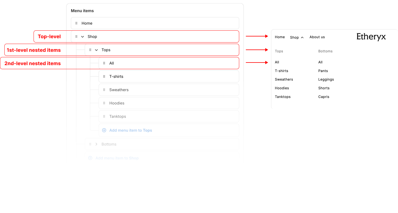
Understand the menu structure
| Menu level | Description |
|---|---|
| Top-level | The main navigation link that, when clicked or hovered, triggers the mega menu. |
| 1st-level nested items | Acts as the title for the mega menu column. |
| 2nd-level nested items | The actual menu links displayed under each column title. |
| You can create up to two levels of nested menu items beneath each top-level item. |
🖼️ Screenshot

Other settings
| Setting | Description |
|---|---|
| Highlight first column | Enlarges the text in the first column for emphasis. |
| Open on hover | Automatically opens the menu when the mouse hovers over it. |
Change header links color
To change the color of a specific link in the header (e.g. SALE), follow the steps in this guide.
Logo block
You can choose to display your logo as either text or an image, depending on your preference and branding needs.
Utility links block
This block contains the buttons for your Cart, Search, Account, Country/Region, and Language selectors.